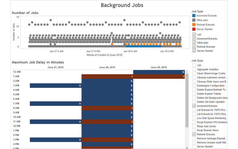
Data visualization is an integral part of data science, offering appealing analytics through graphs and tables from extensive data to enhance Business Intelligence. One such powerful and widely used visualization tool is Tableau, which allows users to create interactive and visually attractive reviews, charts, and dashboards. It offers intuitive data exploration competencies, a drag-and-drop interface, and several visualizations to present information effectively. It supports several data sources and provides advanced analytics abilities for deeper insights. Here are some tips and tricks to know Tableau as a visualisation tool:
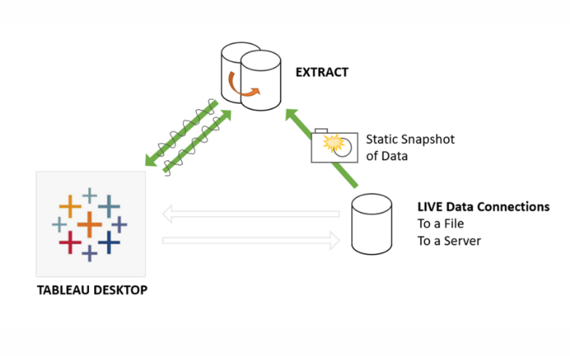
1. Extracts Vs. Live Connections
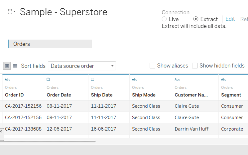
Tableau offers two primary ways to connect to data: extracts and live connections. Extracts are a snapshot of your data that you can use offline, offering faster performance for large datasets. Live connections maintain a real-time link to your data source, ensuring your visualizations reflect the latest data.
2. Data Source Filters
Data source filters improve dashboard performance and simplify your data by limiting the data imported from the source. By setting filters at the data source level, you can focus on relevant data, reducing load times and enhancing overall usability.
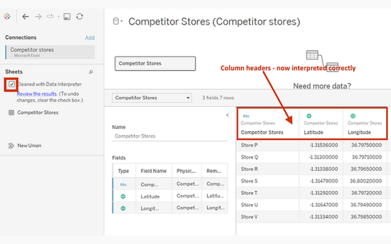
3. Data Interpreter
Data Interpreter is a powerful tool for cleaning and structuring messy data during import. It detects common data issues like headers in the middle of a dataset and provides options to clean and transform data for better visualization.
4. Use Colour Thoughtfully
Colour is a powerful tool for highlighting information and patterns in visualizations. However, using too many colours can lead to confusion and misinterpretation. Thoughtful colour usage ensures that the audience can quickly grasp the insights conveyed.
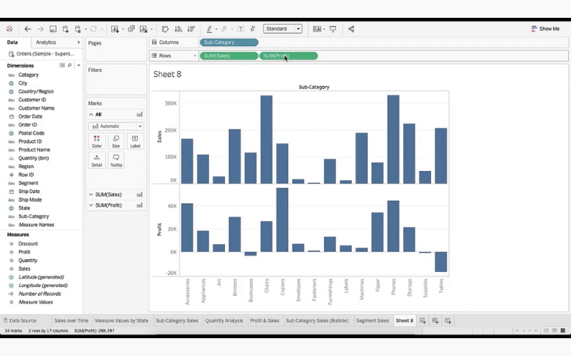
5. Dual-Axis Charts
Dual-axis charts combine different chart types (e.g., bar chart and line chart) in a single visualization. It aids in distinguishing two measures with different scales, providing richer insights.
6. Parameter Controls
Parameters are dynamic inputs that allow users to interact with the visualisation, such as adjusting date ranges or switching between dimensions or measures. They enhance interactivity and empower users to explore data on their terms.
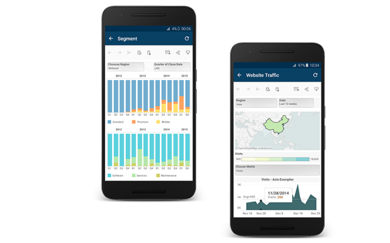
7. Device Layouts
Designing dashboards for different devices (desktop, tablet, mobile), ensuring visualisations are responsive and user-friendly across various screen sizes. It provides a tailored user experience for each device type.
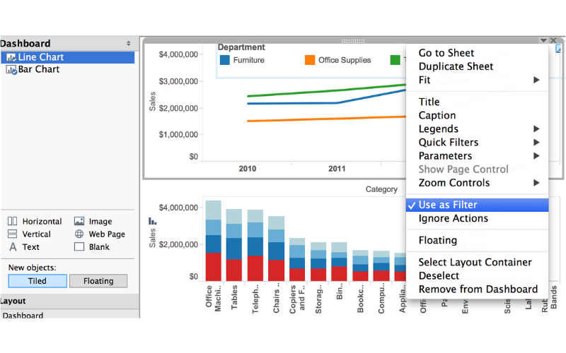
8. Floating Vs. Tiled
Choosing between floating and tiled objects in your dashboard layout impacts the position and size of dashboard components. Tiled objects snap to a grid, providing more structured layouts, while floating objects allow precise control over positioning.
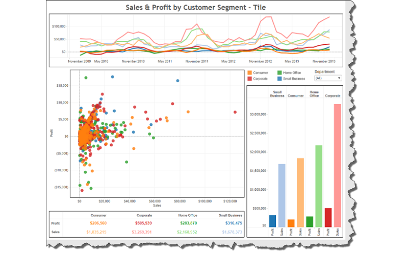
9. Dashboard Actions
Dashboard actions create interactive experiences by linking different dashboards, sheets, or web content. Users can click on a data point to move to another dashboard or view additional details, improving exploration.
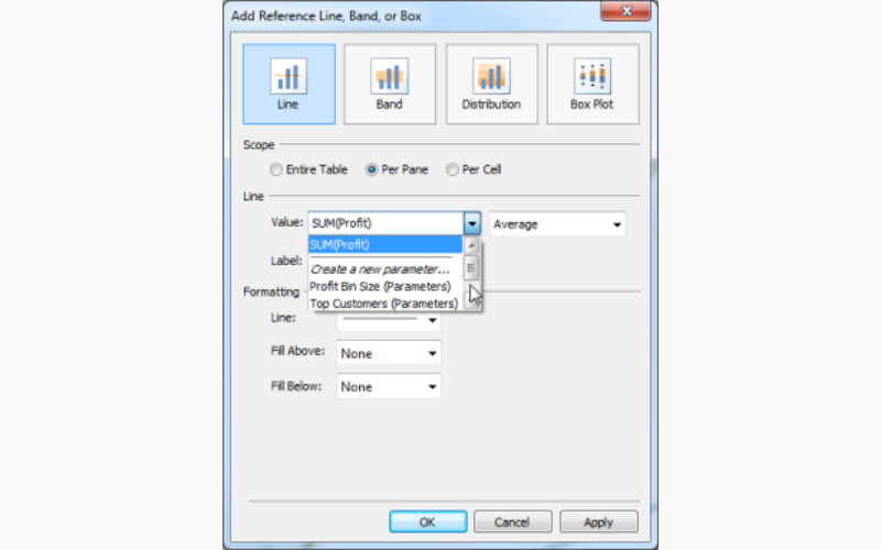
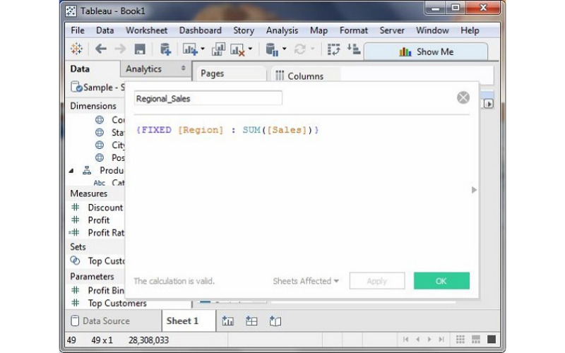
10. LOD (Level Of Detail) Expressions
Levels of Detail (LOD) expressions in Tableau perform calculations independent of the visualisation’s level of detail. They provide granular control over aggregations and computations. These are three types of LOD Expressions: INCLUDE, EXCLUDE, and FIXED.
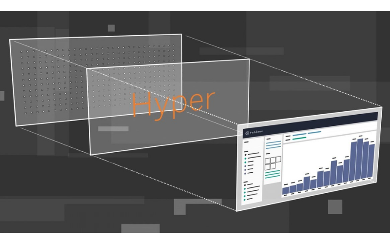
11. Data Engine: Hyper
Hyper is a data engine powering data processing and storage. Its key features are parallel processing, data compression, concurrency, In-Memory processing, and Hyper API, making it apt for handling large datasets. It is created for exceptional speed and efficiency.
12. Custom Geocoding
Tableau’s mapping capabilities are improved by custom geocoding, which allows you to map locations not covered by built-in geocoding. For example, if sales data for specific venues aren’t recognized, custom geocoding defines these locations manually. Key benefits of custom geocoding are precision, mapping unique data, and visualisation.
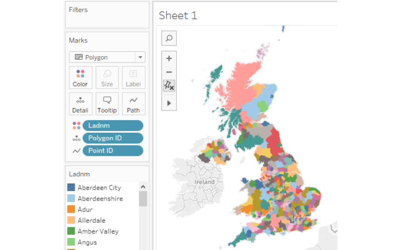
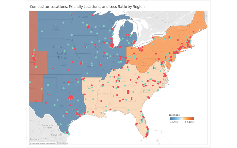
13. Map Layers
Map layers overlay different geographic information on maps, adding context and depth to visualisations. Multiple map layers can be added to a single map view, each representing aspects of data. Common map layers include Background layers, Data layers, and Reference layers. Informative and interactive geographic visualisations are developed by map layers effectively.
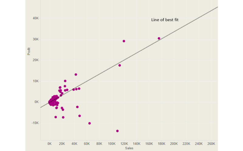
14. Regression Analysis
Regression analysis aids in understanding relationships between variables in data. It supports linear and non-linear regression models, permitting the selection of the most appropriate model for data. Residual Analysis examines residuals to check if model assumptions are satisfied and if there are any patterns or outliers in the data. Regression analysis is valuable for businesses to make data-driven decisions, such as predicting future sales based on historical data or understanding the factors influencing customer behaviour.
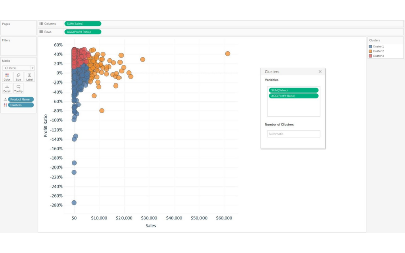
15. Clustering
Clustering in Tableau is a technique that groups similar data points based on selected dimensions and measures. It helps in identifying patterns, segments, or outliers within your data. It is essential for businesses looking to discover hidden patterns in their data, such as grouping customers with similar purchase behaviour for targeted marketing campaigns.
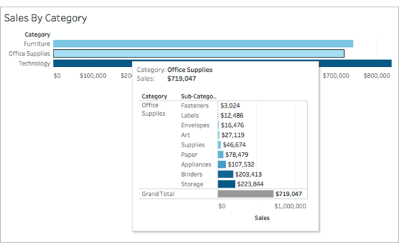
16. Tool Tips
Tool tips offer information when users hover over data points, enhancing the interactivity and informativeness of the visualisations. It is a fundamental feature for creating user-friendly and informative Tableau dashboards to communicate insights effectively and improve the overall user experience.
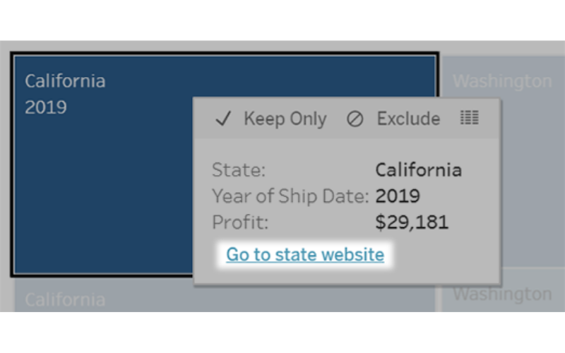
17. URL Actions
URL actions in Tableau enable users to navigate to external web pages or resources by clicking on specific data points or objects within a visualisation. Aspects of URL actions are custom URLs, Integration, Target Options, and Use Cases. It expands Tableau’s capabilities, making it a versatile tool for accessing and integrating external resources, enhancing the overall usefulness of dashboards.
18. Story Points
Story points create interactive narratives or presentations using visualisations. They guide users through a series of views, adding context and storytelling to data. Some aspects of story points include sequential presentation, annotations, interactivity, and Export and Share. Story points are valuable for presenting insights, explaining data trends, or sharing data-driven recommendations with stakeholders in a structured and engaging manner.
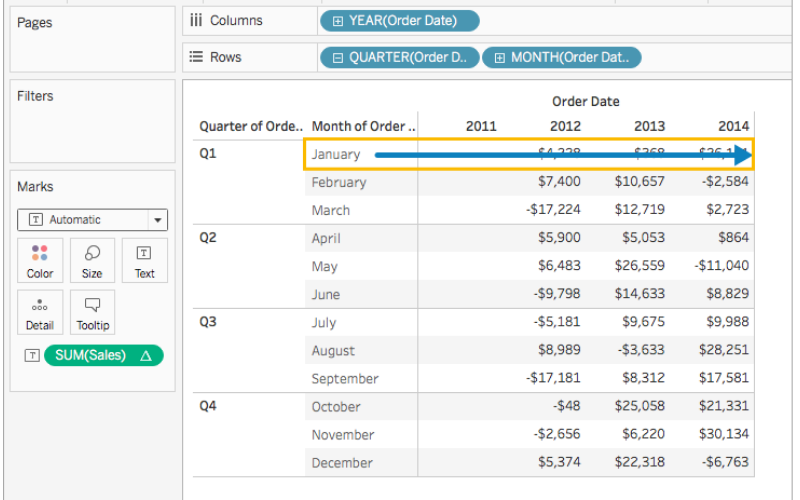
19. Table Calculations
Table calculations perform calculations on the results of queries and aggregates, often involving the visualisation’s context. They enable complex calculations that aren’t achieved with standard calculations easily. They are customised to compute values based on specific dimensions, measures, or partitions. They are dynamic and respond to user interactions within dashboards, offering real-time insights. Table calculations enhance the analytical capabilities of Tableau and provide interactive and context-aware insights within visualizations.
20. Optimize Extracts
Optimizing extracts in Tableau involves improving the performance of data extracts (TDE files) by reducing their size and query times. Key considerations include data source filters, aggregation, and data cleansing. Optimization aims to provide faster load times for dashboards, especially with large datasets. It involves using extract filters to reduce the amount of data brought into Tableau, aggregating data where possible to reduce granularity, and ensuring data cleanliness to minimize redundancy. Extracts can be refreshed on a schedule, ensuring that data remains up to date while maintaining optimal performance.