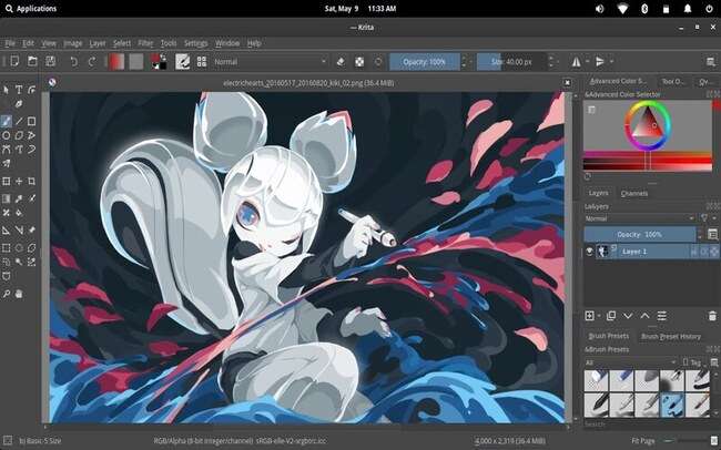
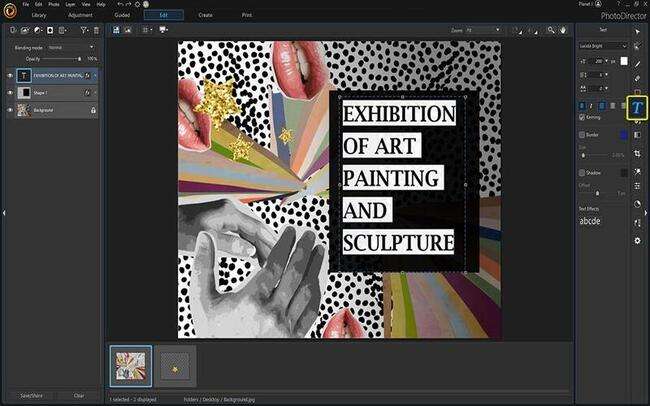
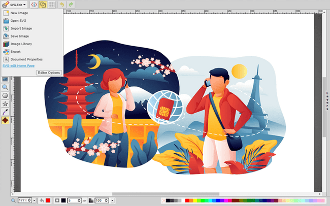
Typography plays a role in design, as it helps create appealing designs. The choice of font pairing is crucial to enhancing the aesthetic and readability of a design. Linux, being widely used by designers and developers, offers readily available font options. Here are 20 pairings for Linux systems Font Pairings for Design.
1. Montserrat And Lato
One great font pairing for headlines is Montserrat and Lato. Montserrat has lines and a modern style that make it perfect for grabbing attention, while Lato’s versatility and readability make it an excellent choice for body text.
2. OpenSans And Roboto
Another option to consider is OpenSans and Roboto. Open Sans is a versatile font for different design contexts, while Roboto’s geometric shapes and friendly appearance make it ideal for headings and body text.
3. Poppins And Source Sans Pro
If you’re looking for an elegant look in your design, Poppins and Source Sans Pro would be a good combination. Poppins offers an appearance that works well with headlines, while Source Sans Pros’ simplicity ensures legibility and reliability as body text.
4. Ubuntu And Noto Sans
Lastly, Ubuntu and Noto Sans provide features for exploring. Ubuntu offers a consistent appearance specifically designed for screen display purposes. On the other hand, Noto Sans provides flexibility with its range of weights for headings and paragraphs. These are some examples of pairings available on Linux systems that can enhance your designs by combining aesthetics with readability.

5. Playfair Display And Source Serif Pro
Playfair Display and Source Serif Pro offer benefits for different types of text. Playfair Display’s classic and elegant design makes it perfect for headlines and titles, adding a touch of sophistication to any design. In contrast, Source Serif Pro’s clean lines and exceptional readability make it an excellent choice for ensuring effortless and comfortable reading.
6. Hind And Oswald
Oswald’s bold and condensed design is perfect for catching attention with eye-catching headlines, while Hind’s contemporary appearance and versatility make it a choice for body text.
7. Raleway & PT Sans
Raleway’s thin strokes and geometric shapes create a sophisticated look, making it an excellent option for headings. On the other hand, PT-Sans is highly readable. It offers a wide range of weights, making it ideal for body text.
8. Nunito Sans & Merriweather
Nunito Sans is an ideal choice for headings. With its rounded corners and well-balanced shapes, it exudes a relaxed and modern appearance, capturing attention while maintaining a harmonious feel. On the other hand, Merriweather’s timeless and contemporary design makes it an excellent option for articles or body text, offering a perfect blend of readability and aesthetics. By employing Nunito Sans and Merriweather, designers can create visually appealing and easily digestible content across various designs.
9. Fira Sans & Liberation Serif
Fira Sans’s clean lines and geometric design make it suitable for headings or titles that need a touch. On the other hand, Liberation Serifs’ classic and traditional look enhances readability in body text or paragraphs, providing a timeless and elegant appeal. By incorporating Fira Sans and Liberation Serifs, designers can seamlessly blend contemporary and traditional elements to create visually appealing and easily readable designs across different sections.
10. Amatic SC & Lora
Lora is a contemporary serif font that exudes elegance while maintaining readability in headings. Its refined design exudes sophistication while ensuring optimal legibility. On the other hand, to infuse text blocks with a touch of playfulness and personality, Amatic SC’s handwritten style adds a unique charm and distinctive visual appeal. By leveraging Lora and Amatic SC, designers can create a harmonious blend of elegance and playfulness, enhancing the overall aesthetic of the design.
11. Lusitana And Cabin
Lusitana has an aesthetic that can captivate attention with its headlines, making it an excellent option for grabbing readers’ interest. They are choices for body text, ensuring readability and a smooth reading experience. When used in combination, Lusitana and Cabin enhance the attractiveness of any design project.
12. Merriweather Sans And Dosis
Merriweather Sans is a choice for headings and body text due to its lines and noticeable x height. On the other hand, Dosis adds a distinctive touch with its geometric shapes and different weights.
13. Karla And Titillium Web
Karla’s friendly and rounded appearance makes it perfect for headings and titles, while Titillium Web’s versatility and extensive character set make it an excellent option for body text.
14. Noto Serif And Source Code Pro
Noto Serif is well suited for headings and titles since it offers a range of languages to accommodate needs. On the other hand, Source Code Pro’s monospaced design ensures readability and ease of use, specifically for programming or code-related texts.
15. Quicksand & Cabin Condensed
Quicksand has a design that brings a modern touch with friendliness, making it an ideal choice for attention-grabbing headlines. Its condensed letterforms allow for more content without sacrificing readability. When combined with Lora or Amatic SC, this pairing creates a functional design that maximizes space efficiency while maintaining an elegant and expressive typographic aesthetic.
16. Rubik & Ropa Sans
Rubik features elements that work well for headings and titles. In contrast, Ropa Sans’s elegant appearance with touches lends itself beautifully to body text.
17. Space Grotesk And Space Mono
Space Grotesk and Space Mono offer distinctive appearances for headings. Space Grotesk stands out with its shape proportions, while Space Mono’s design ensures legibility and user-friendliness for code-related texts.
18. Spectral And IBM Plex Sans
Spectral has a timeless and elegant style, making it perfect for eye-catching titles and headings. On the other hand, IBM Plex Sans offers a range of characters and a versatile design that ensures readability in body text and smaller font sizes.
19. Work Sans And Libre Baskerville
Work Sans has a modern design that works well for headings, while Libre Baskerville provides a traditional look that adds a timeless touch to body text. The modern and straightforward aesthetics of Work Sans bring a fresh and clean look to the text, while the elegant and classic appeal of Libre Baskerville adds a touch of sophistication and refinement. Together, they create a harmonious balance between modernity and tradition. This pairing is perfect for websites, magazines, and other visual media that require a combination of clarity and elegance in typography.
20. Zilla Slab And Zilla Round
Zilla Slab has a sturdy design that grabs attention in headlines and titles, while Zilla Round adds a touch of warmth with its corners, making it playful for shorter pieces of text.
Conclusion
These font pairings offer an array of styles, ranging from minimalism to elegance, allowing designers to create visually appealing layouts in perfect harmony. With Linux system fonts, designers explore their creativity and achieve stunning results that leave a lasting impression on their audience. The font combinations discussed in this article serve as a foundation for crafting aesthetically pleasing Linux-based designs. Feel free to experiment, explore, and discover the ideal pairing that perfectly matches your design requirements